OpsWarden UI guidelines
Owner: web client maintainers · Status: implemented contract · Review: when shared components or tokens change
These guidelines turn the OpsWarden identity into repeatable interface
decisions. They apply to the Next.js client and to the Tauri shell that embeds
it. The implementation in client-web/app/globals.css and
client-web/components/ui/ remains the source of truth.
Brand foundations
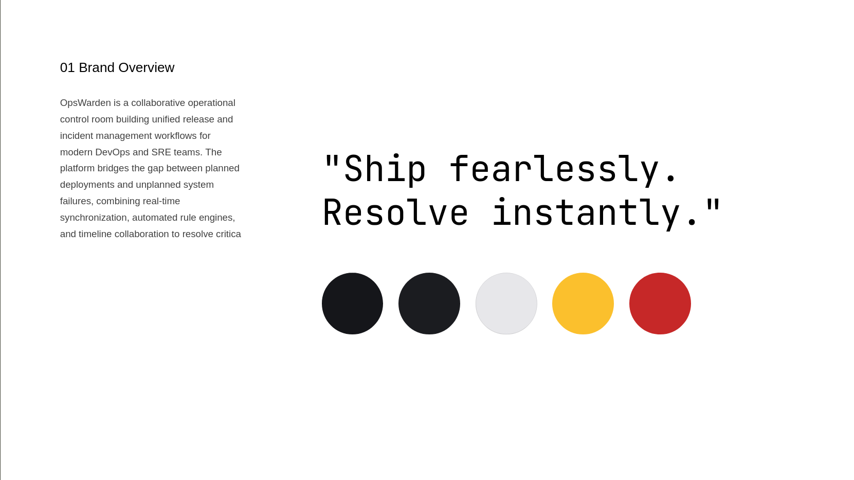
The Pomelli boards below are supporting brand exploration. They are useful for composition and tone, but they do not override implemented tokens, accessible contrast or responsive behavior.
Voice and promise
- Product name: OpsWarden.
- Preferred line: Ship fearlessly, resolve instantly.
- Voice: direct, calm and operational. State what happened, its impact and the next safe action; avoid hype, blame and unexplained acronyms.
- Labels describe outcomes: “Resolve incident”, “Validate step” and “Transfer Manager”, not vague verbs such as “Submit” or “Continue”.
Logo
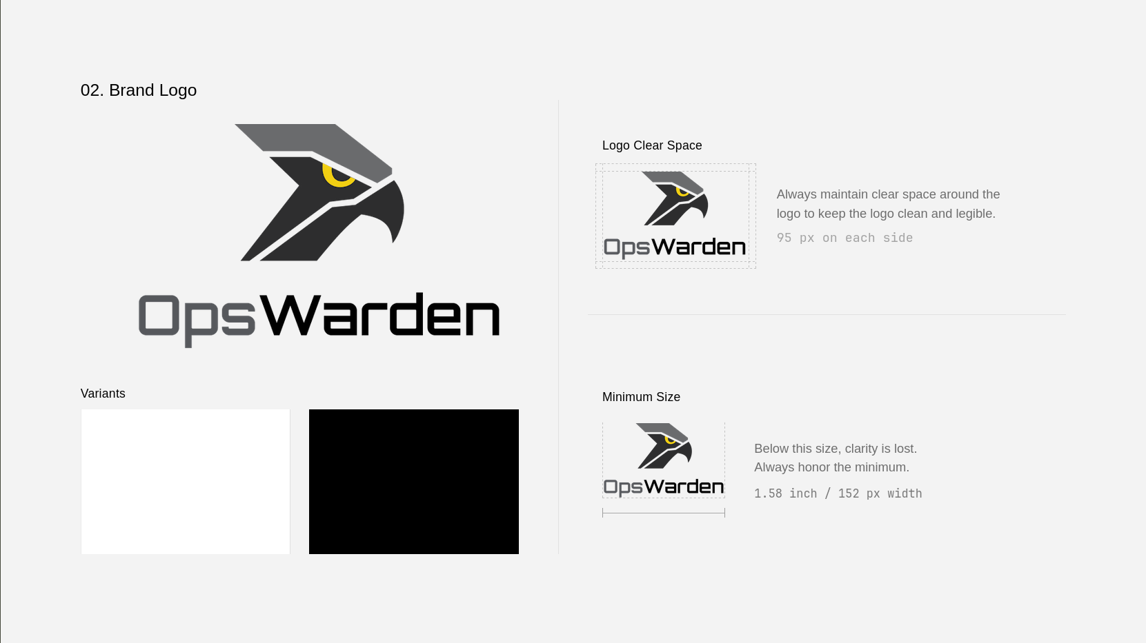
- Use the complete wordmark when the product identity is not already visible; use the shield icon for compact navigation, favicons and app icons.
- Keep clear space of at least 1× the inner eye diameter on every side. The
board's fixed
95 pxvalue is illustrative, not a responsive rule. - Keep the full lockup at least
152 pxwide and the icon at least24 px. - Never stretch, rotate, recolor, outline or add shadows to the mark.
- On dark surfaces use the supplied light wordmark; on light surfaces use its approved dark variant. Never place it over busy operational content.
Typography
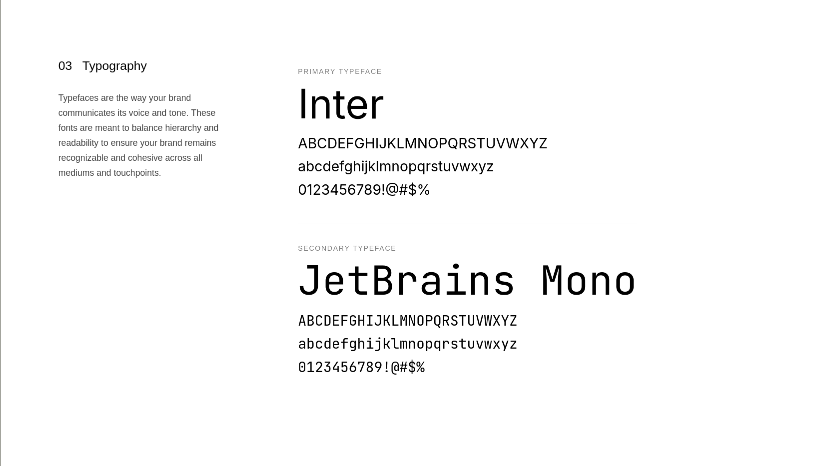
| Family | Purpose | Rule |
|---|---|---|
| Inter | navigation, headings, body, controls | Default interface family; sentence case |
| JetBrains Mono | IDs, timestamps, routes, code and machine values | Use only where fixed-width scanning adds meaning |
Do not introduce a third family. A table may use Inter for human-readable names and JetBrains Mono for an Incident identifier in the same row.
Canonical palette
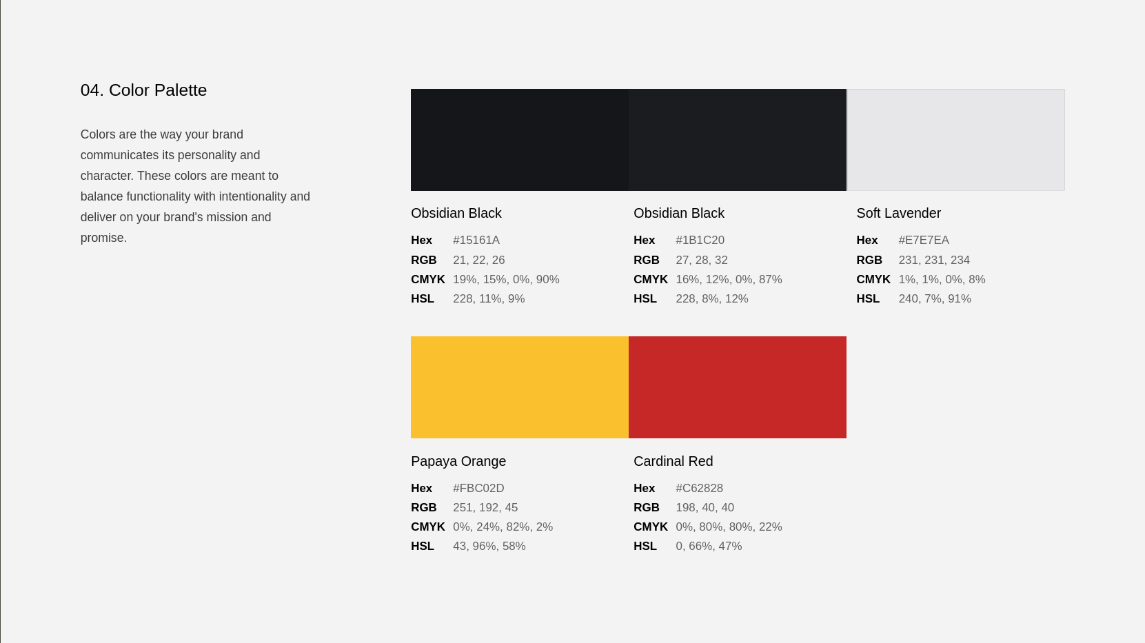
Pomelli's generated color names are not canonical. Use semantic roles instead:
| Token role | Value | Use |
|---|---|---|
| Control-room background | #15161A |
Application canvas |
| Surface | #1B1C20 |
Panels, fields, secondary actions |
| Primary text | #E7E7EA |
High-priority readable content |
| OpsWarden accent | #FBC02D |
Primary action and focus |
| Destructive action | #C62828 |
Explicit destructive controls |
| Muted text | #989BA1 / #878B93 |
Supporting information only |
Never use the accent as decoration around dense operational data. Color is always paired with text, an icon or position when it communicates state.
Operational semantics
Brand colors identify OpsWarden; operational colors encode live meaning.
| Concept | Token | Value | Required text |
|---|---|---|---|
| Low severity | --sev-low |
#5798F5 |
Low |
| Medium severity | --sev-medium |
#F59E0B |
Medium |
| High severity | --sev-high |
#FB7D3C |
High |
| Critical severity | --sev-critical |
#FF5555 |
Critical |
| Open | --st-open |
#FF5555 |
Open |
| Acknowledged | --st-ack |
#5798F5 |
Acknowledged |
| Escalated | --st-esc |
#C084FC |
Escalated |
| Resolved | --st-res |
#22C55E |
Resolved |
The server owns allowed lifecycle transitions. A colored chip renders state; it does not authorize a transition or invent a new one.
Components
Use a shared primitive before adding local CSS. A new variant requires a product meaning, not merely a different color.
| Component | Variants or states | Usage contract |
|---|---|---|
Button |
primary, secondary, danger, ghost |
One dominant primary action per decision area |
IconButton |
same intent system | Must have an accessible name and tooltip where helpful |
Alert |
info, success, warning, danger |
Message tone; never styled like an action |
FormField |
label, hint, error | Visible label; connect description and error programmatically |
Dialog |
open/closed | Trap focus, close with Escape, restore focus to trigger |
ConfirmDialog |
standard/destructive | Initial focus on the safe action; name resource and consequence |
ActionMenu |
closed/open | Keyboard-openable; arrows navigate; Escape returns focus |
OperationalTable |
loading/ready | Desktop scan view with a labelled mobile record equivalent |
PageContent |
loading/error/empty/ready | Every data page handles all four states |
Action hierarchy
- Primary: the single constructive outcome of the current task.
- Secondary: cancel, close, return or a valid alternative.
- Ghost: low-emphasis contextual action.
- Danger: destructive outcome, separated from routine actions.
Do not disable a control without explaining why nearby. During a request, keep the label stable when possible and expose busy state to assistive technology.
Layout and responsive behavior
- Use
AppShell,PageLayout,PageHeader,PageToolbarandPageContentto preserve navigation and loading behavior. - Put the operational identity and status before metadata and actions.
- Prefer a table for repeated desktop records and a labelled record stack on small screens. Preserve the same information and action names in both.
- Keep dialogs for focused decisions; do not turn long exploration workflows into nested dialogs.
- Dense data may scroll horizontally only when a meaningful mobile equivalent cannot preserve it.
Accessibility contract
Every production flow must satisfy all of these rules:
- A native form control has an explicit accessible name; a placeholder is not a label.
- Keyboard users can open, navigate and close dialogs and menus, with visible focus.
- Focus starts predictably and returns to the invoking control.
- Validation and request failures are announced live and remain readable.
- No positive
tabIndexcreates a manual tab order. - Meaning never depends on color alone.
- English and French messages preserve the same ICU arguments and interaction meaning.
- Motion respects reduced-motion preferences and never delays an urgent action.
These are enforced by component tests, flow tests and the static accessibility contract. A visual review supplements those checks; it does not replace them.
Destructive flows and dark patterns
Persistent deletion, expulsion, banning and irreversible cancellation use a
ConfirmDialog with explicit intent. Name the affected resource, explain the
consequence, focus the safe action first and never preselect danger. High-impact
deletion may require typing DELETE.
Do not add confirmation friction to immediately reversible changes such as a filter, emoji reaction or rule toggle. Never hide cancellation, use guilt copy, mislabel consequences or give the risky action stronger visual weight before the user chooses it.
Annotated product examples
Incident queue: scan before action
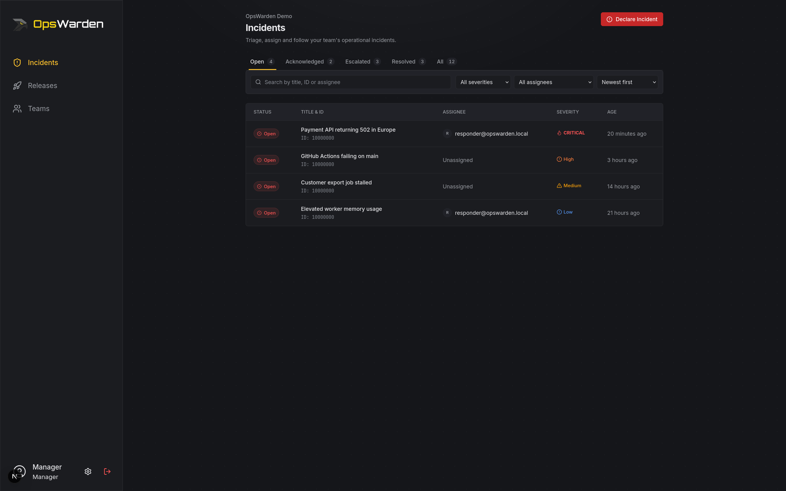
- The page title and team context establish scope before any mutation.
- Severity and lifecycle are both written and color-coded for fast scanning.
- The primary incident action is visually distinct from filters and row actions.
- Repeated records keep identifiers, owners and timestamps aligned; the mobile representation must retain those facts.
Release queue: make blocking explicit
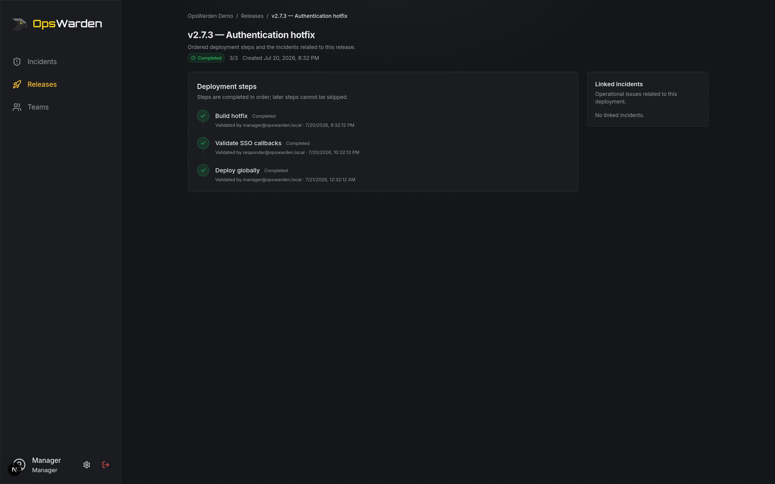
- Release state and ordered progress answer “can we continue?” first.
- A blocked release names its condition rather than relying on danger color.
- Step validation remains a deliberate action and follows server-owned order.
- Cancel is destructive and separated from the normal validation path.
Review checklist
Before merging an interface change, verify:
- Existing tokens and shared components are reused.
- Loading, error, empty and ready states are present.
- Desktop and narrow viewport flows preserve information and actions.
- Keyboard focus, names and live errors work without a mouse.
- EN and FR copy is complete and natural.
- Destructive consequences are named; reversible actions stay lightweight.
- Component, integration or E2E coverage protects the new behavior.
See also the lower-level
visual contract
and the component implementations under client-web/components/ui/.